Wednesday, 22 May 2013

My Evaluation

Daniel Gates   Page 1  5/22/13


My Photo Project – Evaluation

Theme 1 – Exhibition – Skateboarding.

The main subject for my first theme is focused on Skateboarding. I took these pictures because it was on a subject that I was familiar with and I found it really easy to take pictures of something close to me. To me, these photos relate to the main subject, skateboarding, which I enjoy doing in my own time and found interesting to take pictures of.  The photos on this theme all focus on the main subject as they all have something that relates to skateboarding. The elements of design I used on my first theme is rule of thirds, I used rule of thirds so that the audience focused on the main subject of the photograph. Overall I am very happy and proud of my photos, but there could be some improvements such as more shots taken outside or have a wider variety of shot distances. When I asked one of my friends for their opinion on my photographs he said that they were all really good. I improved my old photograph that I had taken and used Photoshop to improve it. I improved the photo by adding a neon glow to the edges and dimming the brightness. I took the ideas from the professional example like the camera angle and sepia filter.
                   Old                                                                     Improved.
 
When it came to comparing my photo to a professional example I used the ideas to make my own version of the Photograph. For example I copied both the sepia filter and shot angle.

My version                                           Professional example         

 
Theme 2 – Client Requirement – Photos advertising technology for a newspaper.
The main subject for my second theme is advertisement on technology for a newspaper. I took these pictures because it was easy as I had lots of items of technology so it wasn’t hard to get some photographs. I made sure that my photos focused attention on the main subject. I did this by specifically making the main subject stand out from the rest of the photograph. The element of design I used for this theme was ‘balancing the elements’ this was very affect for the pictures I had taken. Overall I am happy with the photos I had taken for this project, but however some of them could be improved by taking more time taking them. When I asked some people what they thought of my photos for this project they said that I did a great job taking them. When it came to comparing my photo to a professional example I used the ideas to make my own version of the Photograph. For example I used the same shot angle and I also copied the main general idea.

                                                                                            
     My Version                                                                                       Professional Example
                                                               

Theme 3 – concept – Taken pictures of logos.
The main subject for my third theme is different logos. I took these photographs because it was different and I thought it would be interesting as I had a wide varity of different logos. The elements of design for this project is ‘extreme close up’ I chose this because most of the photographs were very close up and gave a lot of detail. Overall I am happy with the majority of the photos that I took, but however It felt like on some of the photos I was rushed on time so took less attractive photos which could have been improved. When I asked for other peoples opinion on my photo they said they were good but could be improved by taking more time shooting them. When it came to comparing my photo to a professional example I used the ideas to make my own version of the Photograph. For example I copied the camera angle and position to get every piece of detail into the photograph.


         Professional Example                                                                My own version


Wednesday, 8 May 2013

My photographs of Logos.


In this photograph I made sure that I got the correct angle so that the audience could see the whole main visual image as well as the shadow and the logo. I took this this photograph with the vintage border turned on with my camera.


This is one of my favourite photographs because of the angle I had taken it was perfect. I used the macro function on my camera to get all the details in and I even managed to get the light to shine on the metal frame of the logo. I took this picture with the old film filter already attached.


I took this photo with an extreme close up distance and used the macro function on my camera to get all the scratch details on the logo itself. I took this photo with a vintage border around it.


With this photograph I made sure you could see the whole logo but with two objects. To do this I had to place one can slightly to an angle on it's side and then the other can closer to the camera and more closer to the camera. I took this photo with the sketch filter on.


I used extreme close up on this shot as it gave all the detailing of the threading and stitching on the hat, to get all the detail in I used the macro function on my camera. I also took this photo with the vintage border on, I think it made the image more interesting to look at.                         


Monday, 29 April 2013

Editing a photo using Photoshop.

I used Photoshop to edit this photograph using simple techniques such as adding a black and white filter and putting a 'plastic wrap' filter on the photograph. I think it gives the photo more of an attractive look. 

Before.


After.

Friday, 26 April 2013

Using extreme close up in my own Photograph


In this photo I used the technique called 'extreme close up' to get all the detail of the stitching on the front of the hat. This technique also blurred out the background so it focused on the main visual image.


Friday, 19 April 2013

Comparing my logo photograph to a professional example.

Comparing Photo's.

This is the photo I had taken from the internet and used it to create my own version.


And this is the Photo I had taken using the idea of the professional example.


Extreme close up

 Extreme close-ups are one of the standard shots used regularly with medium shots and long shots Extreme close-ups display the most detail, but they do not include the broader scene.

Monday, 15 April 2013

My Tecnology Photographs.

My Photographs.


When I took this Photograph, I made sure that it was a Medium shot distance and that I included as much as possible. This is different than the rest of the photos I had taken as it is not a close-up image.


This is the Photograph I used the technique of Balancing the elements. I found this very affective with this photo as it really brought out the ON/OFF switch on the PS3 and all the surrounding details on the PlayStation. 


This is the photo I had edited using Photoshop. In this photo I managed to get the PS3 logo in and the game behind the console. This is what gave the photo such a good look. I used the Macro function on the camera to make the game look blurred.


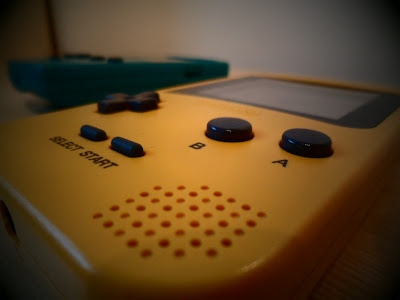
This is one of my favourite Photos as it goes though the generations of Nintendo, oldest being at the back and newest at the front. I used a black and white filter and a black frame around it. This was taken with the filter on the camera.


This is the photo I used the idea from an idea I saw on the internet. I made sure you could see both consoles, I thought this was very affective. I took this picture with the filter already attached, this made the main visual image stand out from the rest of the photograph


With this photograph I put two different objects in the same photo, but I made sure that the two objects both had something in common with each other. They both relate to watching a film on the TV. I took this picture with the filter attached, the filter being sepia as in the old days films were like this.


In this photograph I used a technique to trick people. This being I put the timer on my camera to 10 seconds and placed the camera behind my iPod so that you can see both the camera, iPod and the Blu-ray case. I thought this made the picture different from the rest.


In this photograph I used my iPod and stand to make it look like it was taking a picture of the controller which I had placed in front of it. I had taken this photograph with the black and white filter already attached. Personally this is one of my favourite photos on this theme.


With the Photograph I used the macro function on my camera to get that crisp detail on the PS3 controller and the blurriness of the game behind it. Like one of my other photographs I made sure that both the two objects had something in common with each other. 


When I took this photograph I used the macro setting on my camera to show every detail on the main visual image. In this image it had the cover of my iPod being an old tape with a pair of modern headphones, so i was mixing old entertainment with new. When I took the picture I made sure that it had a sepia affect to make the photo look quite vintage.


In this photo I almost did the exact same thing as the Photo above, accept I changed the iPod from looking vintage to modern and the headphones from looking from the new generation to the old. I also used the macro function on my camera to give the chrome detail of the iPod and the blurriness of the headphones. I had taken this image with the black and white filter turned on.