My Photographs.
When I took this Photograph, I made sure that it was a Medium shot distance and that I included as much as possible. This is different than the rest of the photos I had taken as it is not a close-up image.
This is the Photograph I used the technique of Balancing the elements. I found this very affective with this photo as it really brought out the ON/OFF switch on the PS3 and all the surrounding details on the PlayStation.
This is the photo I had edited using Photoshop. In this photo I managed to get the PS3 logo in and the game behind the console. This is what gave the photo such a good look. I used the Macro function on the camera to make the game look blurred.
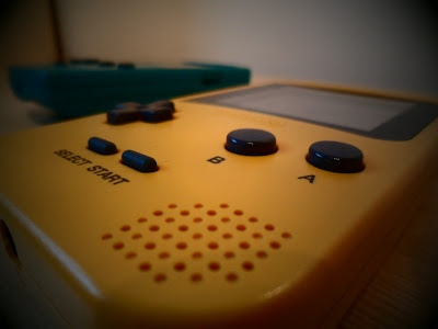
This is one of my favourite Photos as it goes though the generations of Nintendo, oldest being at the back and newest at the front. I used a black and white filter and a black frame around it. This was taken with the filter on the camera.
This is the photo I used the idea from an idea I saw on the internet. I made sure you could see both consoles, I thought this was very affective. I took this picture with the filter already attached, this made the main visual image stand out from the rest of the photograph
With this photograph I put two different objects in the same photo, but I made sure that the two objects both had something in common with each other. They both relate to watching a film on the TV. I took this picture with the filter attached, the filter being sepia as in the old days films were like this.
In this photograph I used a technique to trick people. This being I put the timer on my camera to 10 seconds and placed the camera behind my iPod so that you can see both the camera, iPod and the Blu-ray case. I thought this made the picture different from the rest.
In this photograph I used my iPod and stand to make it look like it was taking a picture of the controller which I had placed in front of it. I had taken this photograph with the black and white filter already attached. Personally this is one of my favourite photos on this theme.
With the Photograph I used the macro function on my camera to get that crisp detail on the PS3 controller and the blurriness of the game behind it. Like one of my other photographs I made sure that both the two objects had something in common with each other.
When I took this photograph I used the macro setting on my camera to show every detail on the main visual image. In this image it had the cover of my iPod being an old tape with a pair of modern headphones, so i was mixing old entertainment with new. When I took the picture I made sure that it had a sepia affect to make the photo look quite vintage.
In this photo I almost did the exact same thing as the Photo above, accept I changed the iPod from looking vintage to modern and the headphones from looking from the new generation to the old. I also used the macro function on my camera to give the chrome detail of the iPod and the blurriness of the headphones. I had taken this image with the black and white filter turned on.


I think your photos are good because you have a natural gift for photography, this is a great advantage to have.
ReplyDeleteI like the angles of which you have taken the photographs at, it helps to make it far more effective.
ReplyDeletei think these photos are effective because of the angle and the way you have edited them these photos will capture the attention of the audience very easy.
ReplyDelete